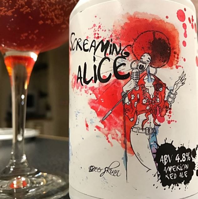
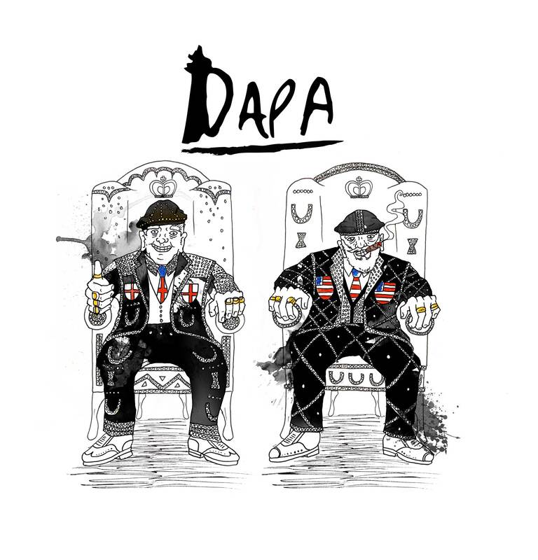
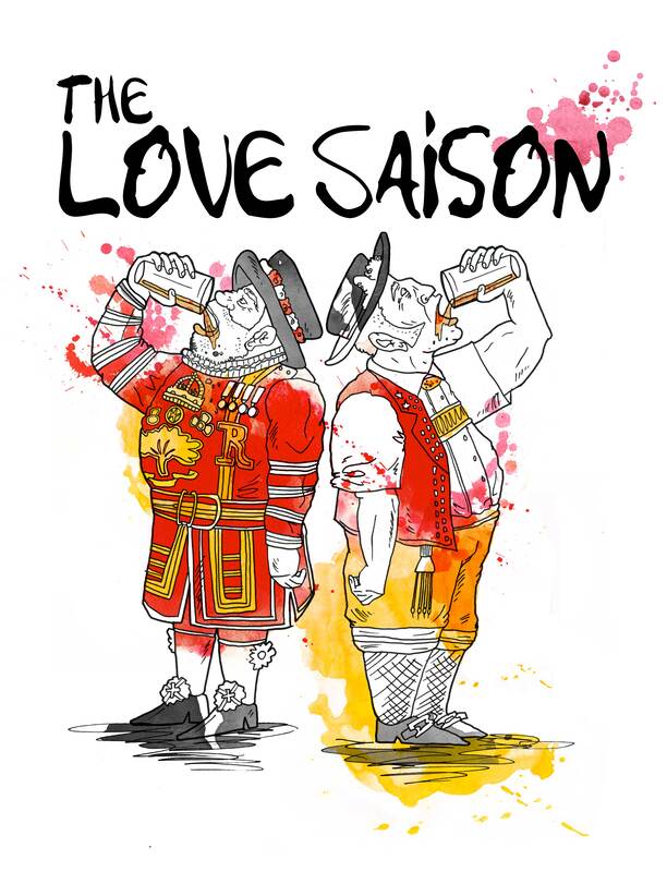
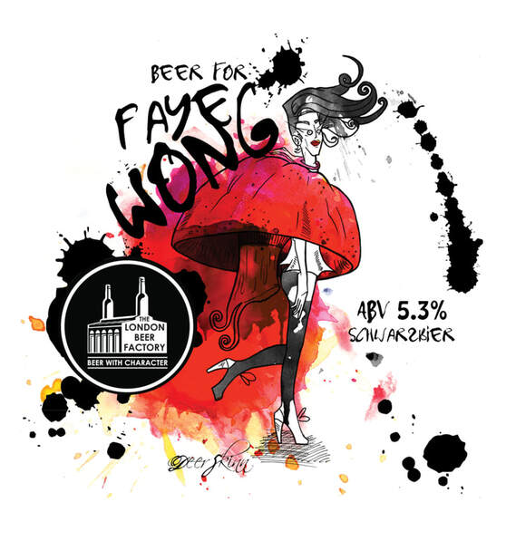
PROBLEM : Redesign the brand identity to visually represent their core values: "beer with character" and a commitment to both heritage and innovation.
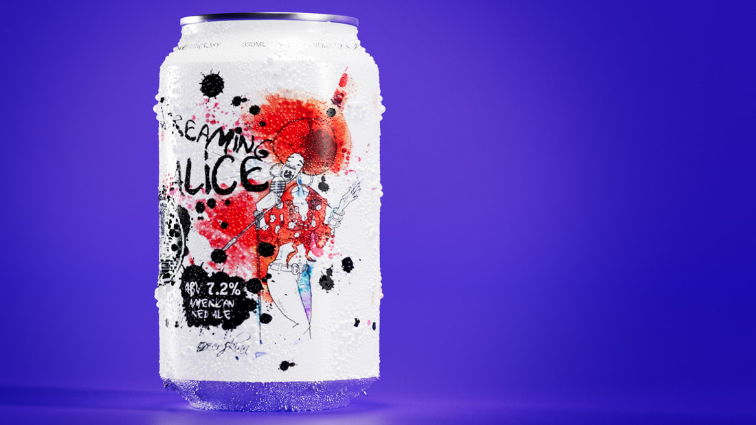
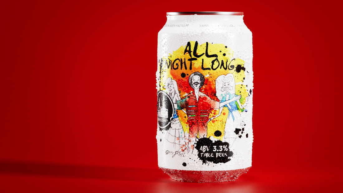
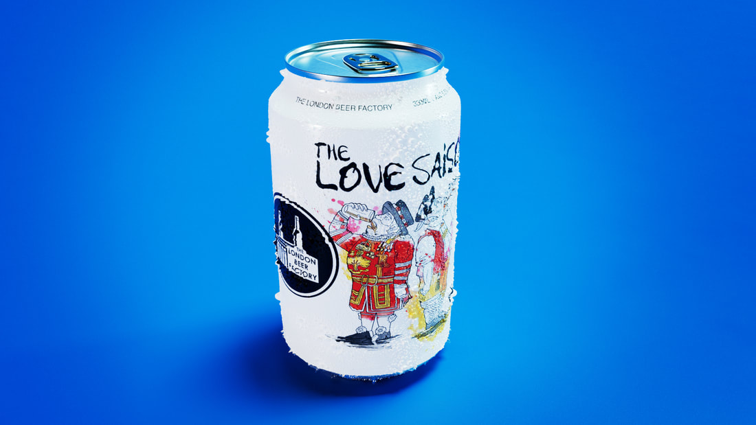
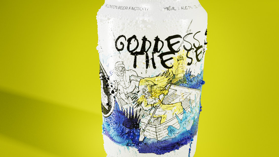
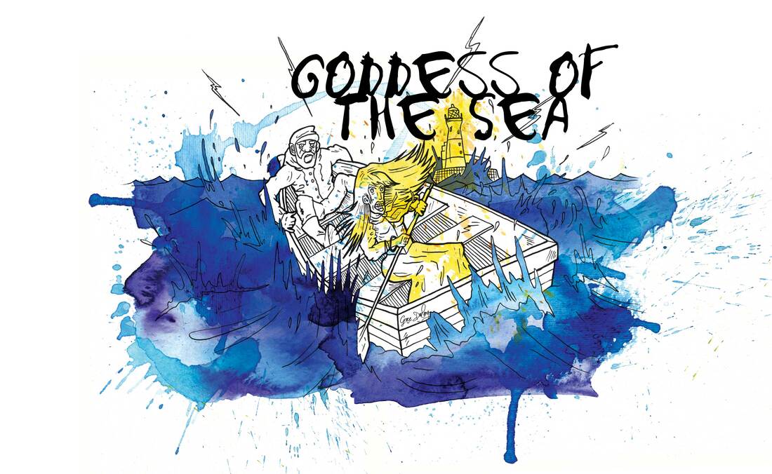
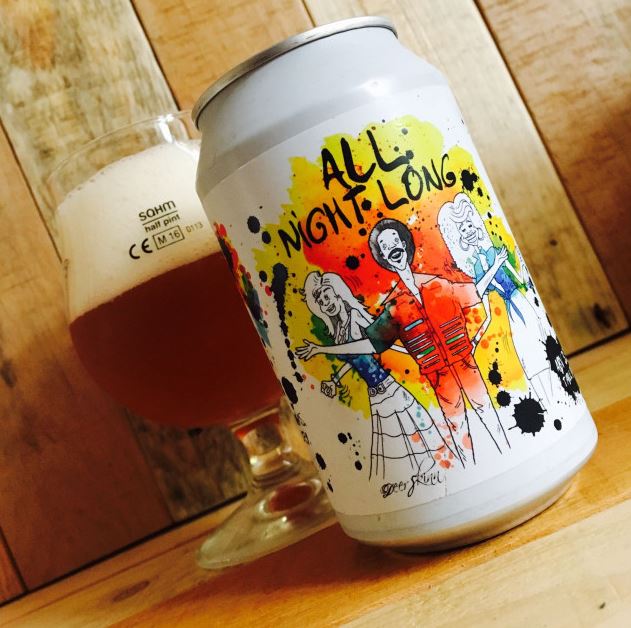
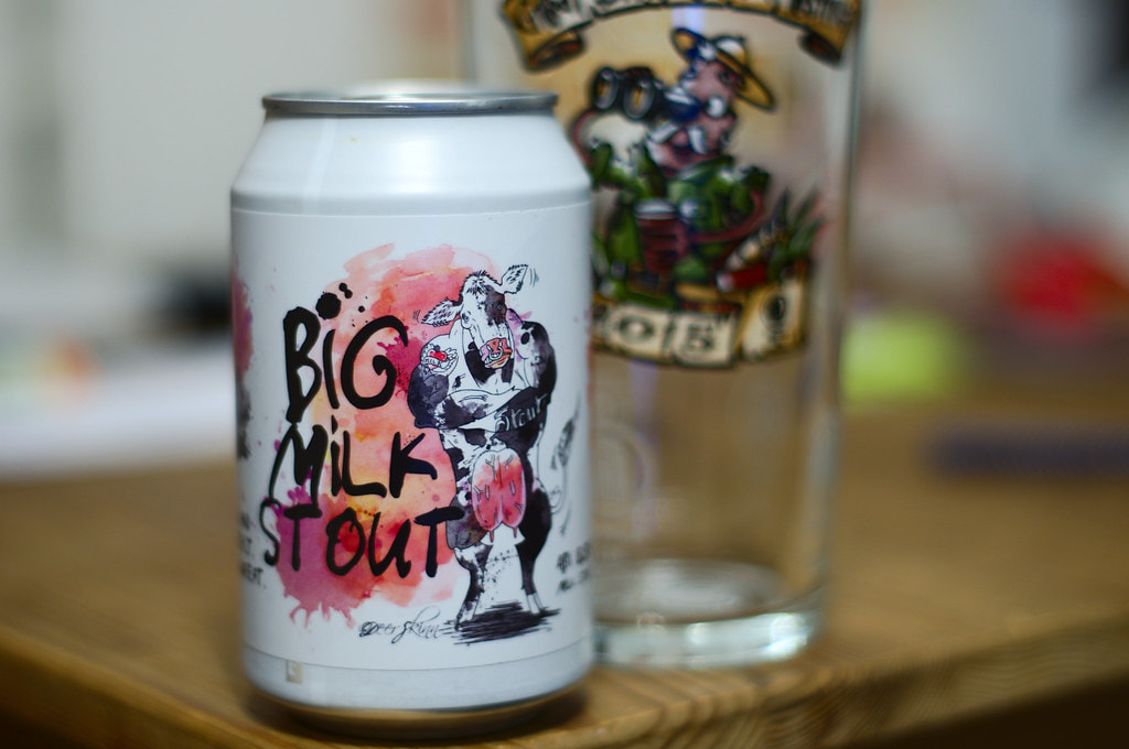
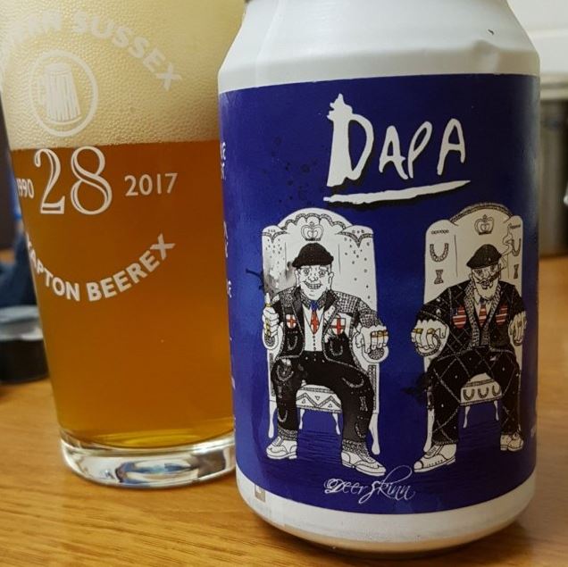
SOLUTION : The client was a big fan of Ralph Steadman, and luckily so am I. So his style served as a springboard for inspiration of the new brand identity. We looked to blend clean character illustrations with watercolor and ink, to make each beer feel unique and visually represent the tasting notes. Embracing the motto "beer with character," each beer received a unique, bold character illustration loosely inspired by historical figures or events. This playful association reinforced the brand's connection to heritage while celebrating its contemporary brewing methods.
The new brand identity effectively captures the essence of The London Beer Factory - a brand steeped in tradition yet pushing boundaries with innovative flavors. The beers can be found across pubs, bars, restaurants, and craft beer retailers throughout London.